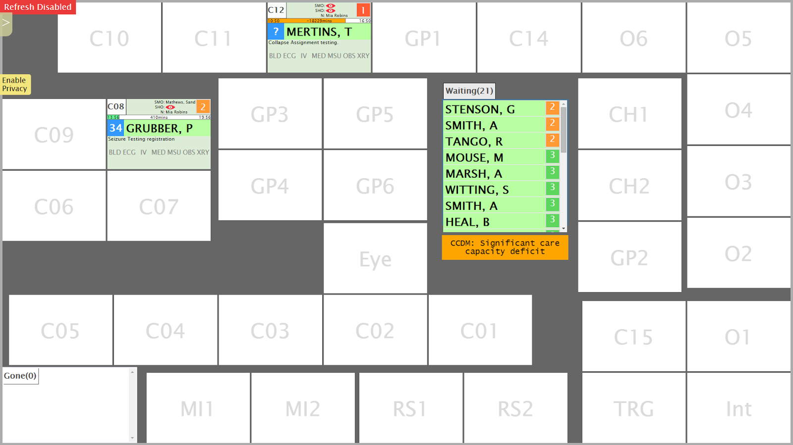
(* calling it a whiteboard is kind of misleading, it's just called that because it replaces a real whiteboard that people draw on with those nice smelling pens I covertly sniff while in meetings. It's probably better described as a ward & patient overview screen)
There are a heap of boxes. Each box represents a bed. These are laid out the same as the ED ward (i.e. this is basically a map of the ED). These run on two 47 inch touchscreen monitors in the ward.
You are thrilled I am sure.
Reasons for having a map view rather than a big ol' table/grid:
- Can see wards status (e.g. occupancy) at a glance
- Easy to locate empty beds or areas that normally shouldn't be filled (overflow areas)
- Groups a patient's data together rather than smearing it across the page in a giant table
- It's in the requirements :/
The big list of patients is all the folks who have been through triage and are in the PAS. You smush your greasy finger against one of these patients and then smush it against one of the empty boxes. This moves the patient! Touchscreens huh, truly we are living in the future.
When the patient is in a room (or 'location', cause they aren't all rooms; some are chairs, some are just empty spots in the corridor (I am actually not joking)) you can see some more data about that patient:
It sure looks like a mess doesn't it. It all is Very Important Information that I can't be bothered 'splaining right now. Additionally, if you then smush your finger against a patient twice it will open a pop-up window:
Because doctors like to order things and have data their own way, the same data from the above is accessible through the clinical portal (concerto) in a grid:
Because I hate grids I made it not really look like a grid and instead look like a stack of sausages because I do like sausages.
Reasons for having a grid:
- Access the data through portal - cramming a map view on a desktop screen is madness
- You can order it however you want, e.g. show most urgent triage value at top
Click columns to sort the grid, or do advanced sorting which is still just clicking columns, but more than one column
And in a travesty of design you can also open the filters which should totally be attached to the column headers but aren't because I like to reinvent the wheel and confuse the users and also partly because I ran out of time


No comments:
Post a Comment